
Eyepowerment
Art Direction ★ Branding ★ Graphic Design

Art Direction ★ Experiential Design ★
Art direction , branding , and cross-channel development for an unbranded campaign empowering women with chronic dry eye. The project spanned from TV to social to in-office materials, creating a comprehensive ecosystem of assets that worked together across multiple touchpoints to encourage sufferers to find treatment.


Educational in-office materials are frequently clinical and uninteresting to patients. For this campaign, I designed a wide range of these materials to facilitate more meaningful conversations between doctors and patients about chronic dry eye. The premium visual approach strategically stood out visually in cluttered medical environments, making use of luxe print stocks, spot glosses, and elevated imagery. Each piece balances clinical information with emotional resonance, helping women recognize symptoms while providing doctors with conversation starters.

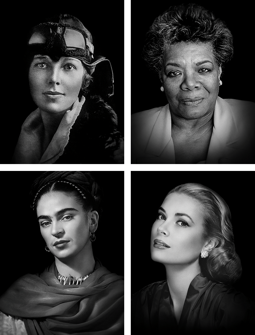
My biggest challenge with this project was establishing a cohesive visual system where iconic photos from different eras could live together harmoniously. This approach allowed historical imagery to feel contemporary while maintaining authenticity, helping to connect with a primarily female audience in a way that felt genuine rather than clinical.
Typography, color, and retouching techniques came together to create the campaign's signature look. The resulting visual identity supported the campaign's goal of encouraging women to advocate for themselves in healthcare settings while maintaining a sophisticated aesthetic that elevated the conversation around a typically underdiscussed condition.
This project was a tricky ask. The media buy had already been made, and market disruptor Love Wellness needed their first ever out-of-home campaign to make a bold, Big Apple-worthy statement.
Without an up-to-date asset library, we had only days to create fresh product visuals for their entire line to use across dozens of unique placements. Keeping things simple, eye-catching, and honest was the solution to make the most with their colorful introduction.
As a bonus, I got to bring our work to life with motion graphics for digital ads alongside our physical station takeovers.

Any opportunity for chromatic
taxonomy is a project
after my own heart


